TL;DR I cover the essentials of any landing page. To succeed you'll need to:
- Craft engaging headlines and subtitles to communicate benefits quickly.
- Support claims with social proof like reviews and testimonials.
- Use images and videos to visually enhance your storytelling.
- Prominent and repeated calls to action guide visitors to convert.
- Convert features into benefit-focused language to persuade.
- Address potential doubts and concerns through FAQs.
- Close with a strong call to action to seal the deal.
Follow these landing page optimization best practices to create high-converting pages that turn visitors into customers.
Landing page First Impression: Crafting an Engaging Hero Section
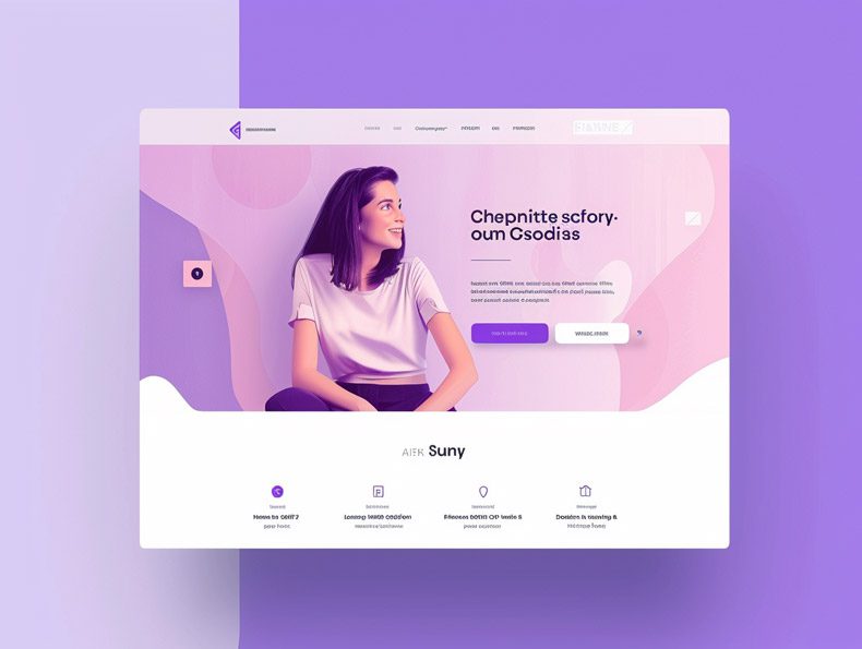
The hero section of your landing page is like the front door of your house - it's the first thing visitors see when they arrive. Just like a great front door makes a strong first impression, an effective hero section grabs attention and introduces your offer in a compelling way.
In general hero section is the very top of your landing page and is fully visible without scrolling on all devices.
Here are some key strategies for optimizing your hero section of your landing page for maximum impact:

Title Optimization: How to Convey Value Instantly
Your headline is valuable real estate - don't waste it.
Craft a title that clearly communicates the core value of your offer. Focus on articulating benefits over features.
For example, "Get Healthy, Gorgeous Hair in Just Weeks" is more compelling than "New Hair Growth Serum".
Use keywords where appropriate, but don't stuff unnaturally. You want a human-friendly, benefit-focused title.
Use this tool to check if you are hitting the emotional notes with your headline or not: Headline Analyzer. As usual, though useful do not put all your faith into what this model tell you, use your judgement.
Landing page Subtitles: Enhancing Your Value Proposition
An effective subtitle expands on your headline by further explaining the value proposition. This is your chance to get more specific about how your offer will improve your visitor's life.
Keep it scannable with short sentences and paragraph breaks. Bullet points can also help call out key benefits.
Try to make these unique. I.e., do the brand flip test - this is when you replace your logo with another competitor's logo and see if the bullet points still read true.
The more generic points will fit both brands, the more unique ones will be distinctly yours.
The Power of Visuals on your Landing page
They say a picture is worth a thousand words. Use images and video strategically in your hero section to showcase your offer and tell a compelling story.
For example, before and after photos, infographics explaining your methodology, or testimonials on video can quickly communicate social proof and get visitors excited.
Choose assets that visually reinforce your headline and subtitle promises. Images that connect emotionally work best to capture attention.
A product mock-up shot is great when you are selling something tangible (or even software). Your image is better when you are offering services, e.g., coach or consulting.
Leveraging Social Proof for Credibility
Sprinkle in some social proof like customer reviews, testimonials or trust logos to establish credibility fast.
For example, "Rated 5 stars by over 1,000 customers" or displaying prominent logos of major media features or partners.
Social proof demonstrates others have used your product/service with success, reducing perceived risk.
Testimonials on the landing page should also be seen as a solution to overcome objections.

Effective Calls to Action: Guiding Visitor Engagement
Once you've captured attention, clearly direct it with strategic calls-to-action (CTAs). Tell visitors their next step.
For example, "Start My Free Trial" or "Schedule a Consultation".
Make CTAs stand out visually with contrasting buttons, and write them as value-focused commands. Avoid generic phrases like "Submit" or "Click Here".
Place your primary CTA prominently above the fold. Additional secondary CTAs lower in the section are also useful.
A Deeper Dive: Elaborating Features and Handling Objections
Okay, you've hooked them with a strong first impression. Now it's time to elaborate on your offer and handle potential objections. This is where you get into the details of how your product/service works, and the specifics of what's included.
Some strategies for an effective middle section:
Turning Features into Benefits: The Art of Landing page Persuasion
Resist the temptation to just list features. Demonstrate how each feature translates into a customer benefit.
For example, instead of "Unlimited cloud storage", say "Never worry about running out of space for your photos and videos again."
People are most compelled by how a product/service will improve their lives. Features only matter in the context of tangible benefits. People compare features but buy on the promise.
Amplifying Your Message with Additional Social Proof
Add more social proof like customer reviews, case studies and trust logos to back up your claims.
One thing I can tell you, there can never be enough social proof.
Side note: This is also why you should seek testimonials from those who engaged with your lead magnets. You need a good arsenal of true client opinions.
For example, quoting raving customers describing specific benefits experienced or showing before and after examples of success stories.
The more credible proof you provide, the more believable your pitch will be. Don't be afraid to pile it on in this section.
The Strategic Role of FAQs in Overcoming Potential Hesitations
Addressing common questions and concerns upfront builds trust and reassures visitors. Display FAQs prominently in this section. In this case a landing page serves as a salesperson, addressing concerns.
Cover why your product/service is worth the investment, how it compares to alternatives, and any other reservations you anticipate. Even if something seems common sense, list it.
Proactively answering doubts in your visitor's mind is persuasive. FAQs demonstrate you understand their perspective.
Sealing the Deal: The Importance of a Strong Landing page Closing CTA
As you reach the bottom of the page, it's time to seal the deal with a clear and compelling call-to-action. Summarize the core benefits and value proposition one more time, and give them an obvious next step.
And remember to always have a CTA at the bottom of the landing page. See, some people like to scroll all the way down, but a lot will not scroll back up. In fact spread CTAs throughout the landing page, make it easy for people to take the next step.
Some tips for an effective closing CTA:
Reiterating CTA for Maximum Impact
Repeat your primary CTA from higher up, and potentially add a secondary one too. For example, "Start My Free Trial" + "Schedule a Consultation".
Repetition drives the point home. Visitors skim, so you want to highlight CTAs multiple times throughout the page.
Make your buttons big, bold and high contrast. Arrows, animation and contrasting colors help them stand out.
Place them above the fold so visitors don't have to scroll to find them. Clear visibility maximizes clicks.

The Finishing Touches: Footer Essentials for a Comprehensive Landing Page Experience
Before you call your landing page complete, make sure to include key footer elements to facilitate an easy visitor experience.
Some important finishing touches:
Navigational Tools and Subscription Options: Ensuring a User-Friendly Experience
- Include navigation links to key pages like "About Us", "Contact", etc. This facilitates easy movement if visitors want to dig deeper.
- Offer an email signup with compelling benefits listed. Newsletters nurture engagement.
- Share social media links to facilitate following. Make it easy for visitors to stay in touch.
- Prominently display customer support options like live chat, phone, etc. They'll appreciate help being accessible.
With these supportive footer elements, you provide a comprehensive experience from top to bottom.
Taking Away the Overwhelm in Landing Page Design
Creating a high-converting landing page doesn't have to be overwhelming. By focusing on a few key elements, you can craft an effective page that persuades visitors to convert.
Here are some of the most important strategies covered:
- Optimize your headline and subtitle to communicate core benefits fast.
- Use images, video and social proof liberally to enhance your value proposition.
- Direct attention clearly with prominent, benefit-focused calls-to-action.
- Elaborate on features while emphasizing associated benefits.
- Handle objections proactively with well-placed FAQs.
- Drive points home with repeated, highly visible calls-to-action.
- Round out experience nicely with supportive footer navigation and subscription elements.
Following these best practices will help you create high-impact, high-converting landing pages that turn visitors into customers. What are you waiting for? Get out there and start optimizing!
You may want to revisit how to set pricing for your products here.
